How many new images did you look at today? How many of those were on websites, or on a tablet or iPhone? Probably too many to count, I’d guess.
A few years ago we consumed our photographs mostly in physical form – a few on TV or in movies but the vast majority in newspapers, books, magazines and billboards. And most of these we saw at a pretty good size.
Now, we get most of our images through the internet, and a lot of them we see are very small, at least initially. This is the curse of the thumbnail.
Read Simple
When we look at a page of thumbnails, some are obviously easier to ‘read’ at a small size than others. The simpler the image, the more it makes sense to us when we can’t see much detail. So simple images with tight crops, strong contrast and bold colors stand out. More complex composition and subtle palettes tend to get lost at this size.
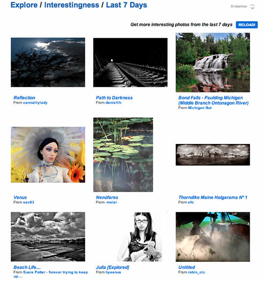
Here’s a page from Flickr’s Explore section recently – my grab is reduce from actual size, so the effect is even greater, but which images are the most immediately compelling? For me, it’s the doll and the railway tracks. I can clearly discern what they’re about.

Some make almost no sense at all seen at this size – the bottom right dusty mechanical thing, for example.
So we gravitate towards the images we think we understand. This is a natural response when we don’t have enough detail to work out what we’re looking at – nobody likes to be confused.
When we click on the thumbnail we can understand, there’s often not that much more to explore when we get to the larger version. Being a simple image isn’t necessarily a bad thing – if that’s what you wanted to say and the image achieves this, then that’s fine.
But what if the photographer wanted to say something that took a bit more explaining? By jumping on the thumbnails of the simpler images, we’re often missing fantastic images.
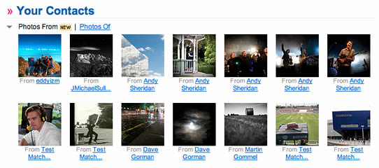
Here’s a grab from my Flickr contacts recently:

From this selection, I might choose one of the concert images to look at larger. But I’d be tempted to skip over the black and white one second from the left on the top row, because I can’t make it out at that size. Which would be a shame, as it’s a fantastic night time view of Mount Rushmore.
Similarly this is one of my favorite images from this summer (in thumbnail format): 
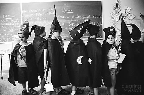
Taken at my daughter’s ‘wizarding camp’ (they made their own cloaks, hats, spell books, wands and rings), it just doesn’t read well as a thumbnail.
But viewed large (as it is below), there’s enough detail for your eye to move around the shot, with the face of the girl on the right being the key element, contrasting with the ordered lines of the rest of the kids facing the other way. Compositionally, it’s not brilliant, but it rewards spending a little time with it.

If you’re as good as Jeff Ascough, however, with great composition that balances elements and leads the eye, seeing patterns as people move through a wedding, then your images really shine under careful examination of large versions. But seen among a bunch of other thumbnails, you might pass over them.
Trouble begins at home
To counter this, photographers are increasingly displaying their images as large as they can online. 1000 pixels wide is not uncommon in photo blogs (such as one of my new favourites Shoot Tokyo), and portfolios often include full-screen slideshow options.
The increasingly popular photosharing site 500px uses much larger thumbnails than Flickr (which has a real whiff of a dead man walking at the moment). But as long as there are web pages, there’ll be small online images, which do some of our images a disservice.
But the problem starts before the images even make it to the computer. We’re all so used to reviewing our images first using the small LCDs on the back of our digital cameras, and these have the same drawbacks as online thumbnails. Simple close-ups read better at that size than more complex compositions.
We like the reassurance that we’re on the right lines as we shoot, but when we respond positively to images that look good on the back of a camera, we (subconsciously I’m sure for most of us) gravitate towards taking those type of shots in the first place.
Think wide and deep
When I started shooting portraits, my first response was definitely like this – get in tight to the face, blur the background and be done with it. There’s nothing wrong with this approach, except if it’s your only approach.
Now I consciously try and look for compositions that show more of the subject and more of their environment. These often take more time to frame correctly – there’s a thin line between distracting clutter and evocative surroundings – and of course the subject’s face is smaller in the frame.
It’s harder to tell if these are working just by looking at the LCD after I’ve taken the image, but of course photographers for decades didn’t have this luxury and had to wait until they got back to the darkroom to see what they’d got. They had to see the shot in their mind before they made the image, rather than just trying a bunch of stuff and seeing that it looked like immediately afterwards.
We would do well to follow this approach. Slowing down when we shoot, visualizing shots in advance, instead of being led solely by the instant feedback from the LCD. We should start thinking a little wider in our compositions, and a little deeper when it comes to evaluating both our images, and other people’s when we see them online. Let’s lift the curse of the thumbnail.