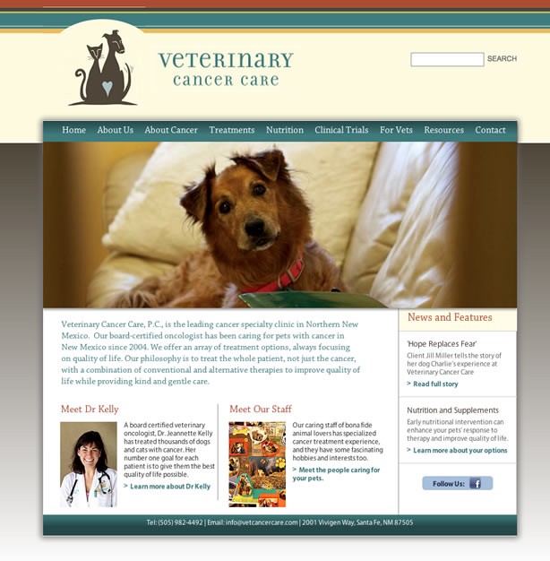
I’m very happy to announce the launch of the website I worked on for Veterinary Cancer Care (VCC) — a veterinary oncology practice based in Santa Fe and Albuquerque.
The site is a great example of the sort of holistic approach I like to take to a client project — I worked on the web development, photography and multimedia work to bring it all together as a consistent whole.
Dr Jeannette Kelly of VCC is a devoted and caring vet, and her practice has helped thousands of pets with cancer. Her website was out of date and didn’t really communicate the key message of the practice — that treating pets with cancer is completely different from treating humans with cancer.
The feel of the practice is warm and caring, and although it’s obviously a difficult time for clients, they were positive and grateful for the compassion and skill Dr Kellly and her staff showed to the pets under their care.
Since most visitors to the site would be coming after receiving bad news from their primary care vet, it was important to dispel their misconceptions and make them more comfortable considering VCC.
It seemed to me that explaining the treatment options and the qualifications of the staff, while necessary, wouldn’t be enough to counter the potential client’s idea that veterinary oncology was going to mean suffering for their pet in a cold and unwelcoming environment. We were dealing with powerful emotions here, so an appeal only to reason — however much it made sense — wouldn’t be enough. An approach that also worked to calm fears and make an emotional connection was also important.
Having spent time at the practice, I knew that the atmosphere there was warm and positive, and the animals loved and cared for. Dr Kelly herself encapsulated this feeling that was so different from what you might expect when you think about cancer treatment — she’s bright, energetic and funny. When talking to owners, she’s often to be found on the floor at pet level, bonding with the animals.
I decided to use documentary photography to capture the authentic experience of the practice, and then record an interview with Dr Kelly about how approach and how she got started with veterinary oncology. You’d want a vet who was emotionally committed to this difficult side of medicine, and Dr Kelly’s story shows she has this in spades.
The audio from the interview would be packaged with some of the still images and background noise of life at the practice, and we would use that on the About page.
Introduction to Veterinary Cancer Care, Santa Fe, New Mexico from David Moore on Vimeo.
Meanwhile, the Amy, Megan and Jan from VCC started gathering useful information and resources so the site would make a compelling emotional case but then back it up with practical information for new clients who need to learn a lot in a hurry.
VCC already had a good graphic identity and color palette that they used for print materials, so that was foundation of the web design. We also wanted the design to be calming, warm and welcoming — the feelings you get walking into the practice. So the use of serif fonts and subtle shading and textures creates a site that is clean and simple to use without being austere.
Looking to photograph authentic moments of what happens in the practice takes a lot longer than just staging some shots with clients, vets (and animals) all smiling at the camera. You have to be there, in the right place to make strong images out of what really happens. A little exchange between staff member and owner, or a pet suddenly licking Dr Kelly’s face are situations that you can’t set up, and if you miss the shot, it’s not coming again. But I feel that people can tell what’s real and what’s fake, and real images have so much more force.
There are more photos from the project here.
The combination of a clear approach, good design, photography, multimedia and useful resources presents an authentic and positive view of Veterinary Cancer Care. And personally, it was one of the more rewarding projects I’ve worked on recently, as I got to see the great work that goes on there, and help them communicate what they do.
And the folks at VCC are also happy. Dr Kelly says,
‘We are delighted with our new site because it captures the essence of our practice and the hope we get from our patients every day.
‘David immersed himself in Veterinary Cancer Care for several days in order to capture the sights, sounds and perceptions of the clinic, and the website mirrors the feeling of our space and our philosophy perfectly.
The website design and photographs emulate the light, bright, welcoming feeling our patients and their people get when they come to see us, and our focus on hope and care is clearly the foundation for the design.’
You can find them at http://www.vetcancercare.com

(and 18mm F/2.0
and 35mm f/1.4
lenses) that made the trip with us across the Atlantic.


