Integrating Photoshelter and WordPress — a quick guide
Integrating Photoshelter and WordPress — a quick guide
As a photographer and web designer, I’ve built my own photo sites and ones for other photographers, and I’ve always been frustrated, until I just combined Photoshelter with WordPress.
The problem is that photographers’ sites often need to combine both excellent photo handling and display, and also good handling of text-based pages.
Some photographers’ site solutions (especially Flash-based ones such as Evrium) don’t let you have more than the most basic amount of information about you — say 1 page of a bio, and 1 page of contact information.
But photographers might want to have a blog, details on the type of work they do, articles they’ve written . . . all kinds of stuff. This helps them differentiate themselves and do well in search engine listings.
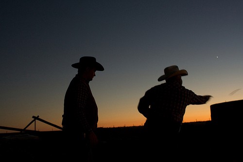
But they also want great galleries, slideshows and if possible, the ability to sell prints or license their work right away.Here’s where the combination of Photoshelter and WordPress is a real winner — Photoshelter handles the images side brilliantly — from slick portfolios to full-on searchable and buyable archives — but it doesn’t do the text stuff so well — we’re back to the one About Page and a Contact form.
But a blogging tool like WordPress handles as much text-based content as you could throw at it. So it’s as easy to update the blog or other pages as it is to update the images. And with Photoshelter’s customization options, that’s what you can do.
Here’s my experience of the process, based on the work I’ve done on my own site (this one): http:/www.clearingthevision.com/ . It’s still a work in progress, but I’ll outline how I did it, in case it’ll help other people.
I should repeat here that I’m a web developer by trade, so while this wasn’t a fiendishly difficult project for me, I’ve spent years creating custom WordPress-powered sites and generally messing with CSS and HTML, so YMMV.
1) Basic Approach
I had a WordPress installation on my own server (at www.mysite.com), and used the CNAME functionality to rename my Standard Photoshelter account (you’ll need a Standard or Pro account to give the customization features) to archive.mysite.com.
I then also chose all the settings and layout options I wanted using the admin panels for the Photoshelter theme I was going to base the site on (Induro — the lighter background option). This meant that when I need to mess with the templates, the layout and setting were at least what I wanted for the gallery and other photo-related options.
Then I tweaked one of the Photoshelter Themes (Induro) to be the basic template for both the WordPress and Photoshelter sides of the site. I adjusted the header code on the Photoshelter so the navigation options were consistent across both sides.
2) Handling style sheets
Skinning WordPress to look like the Photoshelter theme and working out where the the style sheets should reside are the two big issues. I copied the source of the pages and the css files from Photoshelter side and used them as the basis for my WordPress design.
I built 2 sample pages locally in Dreamweaver — the site’s homepage, and a basic 2-column subpage design that would work for the blog and the more static pages.
Then I backed those designs into my WordPress install — essentially slicing the header, footer and sidebar up into different .php files, and creating unique templates for the homepage, basic text page, single blog post page, and the first page in the blog section.
When I was done, my new style sheet (containing all the photoshelter code, plus some extra styles just for WordPress) resided in my WordPress install.
It would be great if the only thing you had to change on the Photoshelter side were the main navigation options (and uploading your own logo). However, the Induro theme I liked didn’t have room for all the navigation options I wanted — it butted them up against the logo. (The theme also uses unnecessary tables, which is pretty old-school — it would easily be possible to rewrite the HTML using just CSS for almost all the layout)
So I had to redesign that a little, which meant I had to use the updated styles in my WordPress install for the Photoshelter pages too. This also meant copying the page background image (in my case, the gray to white gradient) over to the images folder on my site.
I also had to copy some of the other smaller images over — ones for Next and Previous arrows, for example.
3) Result
I now have a consistent look and feel for my whole site. Static pages (like the About information) are run as Pages in WordPress, so I can assign parents and sibling relationships if I want more than one page in a section (like the About section, where I have a subpage for my gear). The blog is a straight WordPress blog under the hood, so keeping that updated is very straightforward.
The site homepage is a Page in WordPress with its own template, with the Photoshelter slideshow and the most recent blog posts displayed (and some less frequently-changed information). This means I can update that slideshow very quickly in Photoshelter, and the changes will be reflected on my site homepage, and the names of any new blog posts will be shown here too, keeping the front page fresh.
4) Suggestions for Photoshelter
In addition to removing as many tables as possible from the Photoshelter themes, it would a great help to customizers like myself if the themes had a navigation bar that could run the full width of the page by default (some of them may — I didn’t check all of them before I started).
Since you’re likely to be adding new links (in my case, to my blog, a home link, a contact page and a page on my Aperture consulting), the room to run more nav options across an existing design would mean minimal adjustments to the Photoshelter side of the house.
Copyright issues — I took the Induro template wholesale, and applied it to my WordPress blog, making some adjustments along the way. I’m not technically sure this is what the Photoshelter folks had in mind with their templates, but it’s easier to make the rest of your site look like a PS template than it is to make the PS side of things look like the rest of your site. I hope they’re fine with it, but a note in the customization help to let us know if that’s OK might put some minds at rest.
5) Conclusions
You need to be pretty comfortable messing around with the inside of WordPress templates, but it took me perhaps around six hours to do the first major work involved in merging my Photoshelter site with my WordPress site.
(I already had a custom WordPress install that was set up the way I wanted it — if you were starting from a default template, or wanted to make more substantial changes to the PS themes, it could easily take as long again or more).
Even though I’m not completely finished yet, I’m really happy with the result. It’s scalable, so I can keep adding photographs and blog postings to my heart’s content and the twin systems should cope.
Drop me a line if you have any questions, if you’re planning something similar and I’ll try to help you out.
Of course, if you’d like me to do the heavy lifting for you with a project like this, I’d also be happy to talk to you.
By David Moore on August 15, 2009.
Canonical link
Exported from Medium on October 17, 2020.

 Having a solid website is a great start, but increasingly a good social media offering can really make the difference with your online presence.
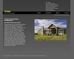 Shaw Architecture, P.A a long-established architecture firm here in Santa Fe chose Moore Consulting to design and develop their new website, which has just launched.
 I’m delighted to announce the launch of our latest website — it’s for Jeff Henig, an American travel photographer based in Japan, who specializes in shooting cultural and religious festivals across Asia. You can check it out at
 Choosing Fluid Galleries for the
 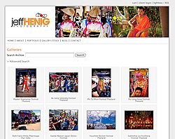 Oh, and the working with someone in Tokyo bit? No problem. A few Skype calls pinned down the requirements and the plan (although talking to someone in the evening for me while it was lunchtime tomorrow for him took some getting used to).