Categories
Moore Consulting Photography

How to take better photos for your blog and social media channels

It’s great to see real organizations posting regularly on Facebook and Twitter, writing blogs and being open and authentic in their communications.

Part of this is strategic — we’re moving away from the old days of a senior figure in the company or non-profit checking every communication that goes out of the place themselves and hiring PR people or ad agencies to polish a message until it shone (even if it didn’t represent the truth of the organization). Now, your audience wants to know what’s it really like behind the scenes, and for its employees to show some of their own personality and that of the organization.

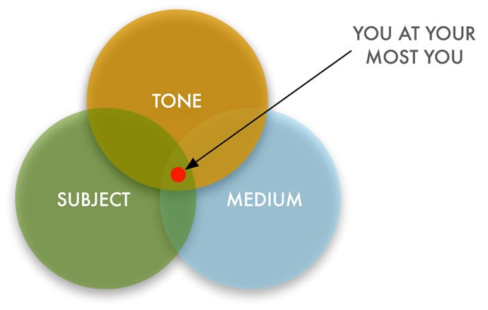
Not all images are the same

But after the strategic comes the practical — you’ve got the plan and now you have to implement it well. So let’s assume that your organisation is writing blog posts, tweeting up a storm and using Pinterest like nobody’s business. You’re taking lots of photos at events or of products, but the problem is that none of the images look very much like the ones you see on the charity: water or ONE sites.

Poor photography makes you look amateurish, and turns the most lavish party into a dull-looking event or an attractive product into an e-Bay advertisement. NYC event organiser Jeremy Norman speaking in a Photoshelter blog post on event photography made it clear: “We’re very big on creating moments in the events — different opportunities for exciting photographs. Because if you’re going to spend one, two, three hundred thousand on an event you definitely want to have memories that are well shot and well photographed.”

You might not spending that much on your events, but the chances are you still need some better photography to create more impact and reflect your organization more positively. And if your blog posts have a more news feel to them, or you case studies tell particular stories, then you also need good photojournalism-style photographs to accompany that content. Finally, if you’re a fundraising organization, photography can play a key role in engaging potential donors.

I can make a very good case for employing a professional (and I’d love it if you’d call me, especially if you want documentary-type work or multimedia), but if that’s not an option here are some key tips to help you get better social media and blogging photos on your own.

1) You don’t need a good camera

Digital SLRs and other expensive bits of gear are really good at delivering great images, so long as the person using them knows what they’re doing. So rushing out and buying a new camera probably won’t help you if you’re going to leave it on auto-everything mode and just use the kit lens it came with. Good pans won’t make you a good cook.

Even with a point and shoot, or a cellphone camera, you can get better images if you concentrate on the points below (except the last one where I explain that you really do need a good camera for some kinds of shots).

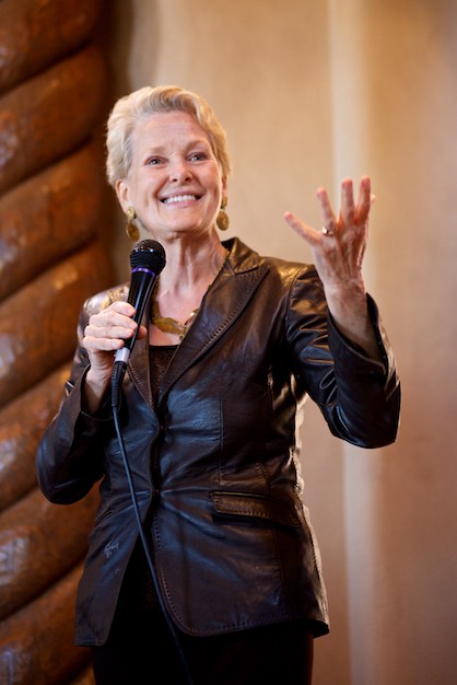
Swanee Hunt, founding director of the Women and Public Policy Program (WAPPP) at Harvard University’s Kennedy School of Government, and former United States Ambassador to Austria addresses a Democratic Party fundraiser in Santa Fe.

2) What’s your photo about?

This is the first question to ask as you’re picking up a camera to take an image. You probably know what it’s going to be a photo ‘of’, but that’s not what it’s ‘about’. What are you trying to show or tell with this image? You could take five different photos of a chair and say different things with all five.

Once you know what your’e trying to communicate with the image, it will help you decide what to put in and leave out. Do you want a candid moment, where the subject’s not aware of the camera, or are you going for a posed shot with everyone smiling, for example? What emotion are you trying to capture or communicate? It might not be a very complex idea, but if you’re just snapping away and hoping you get something good, it’s not very likely that you will.

3) Only show what’s important

Most amateur photographers leave too much in the frame when they’re taking a photograph. When you look at the world, your eye focuses on the subject you’re considering at that moment, and you don’t really notice the things around it. But when we look at a photograph, we tend to see everything that’s there, diminishing the visual importance of what’s supposed to be the main topic. So as your’e composing your image, make yourself look all around the frame and check that there’s a reason you’re including all the elements.

Sometimes things are improved by zooming in or getting closer to the main subject, removing some of the clutter. Other times if you move sideways, you’ll exclude a distraction like a sign or a trash can.

4) Head in a clean spot

Many of your photographs will probably include people. Try and make sure their heads aren’t in front of a distracting background. This could be the line of a wall running behind them, or a tree branch appearing to come out of the back of their heads. Watch for part of the background being darker than the people and part of it being lighter. A flat even background will make sure the viewer’s eye stays on the people — and your eye is naturally draw to the light areas of a frame.

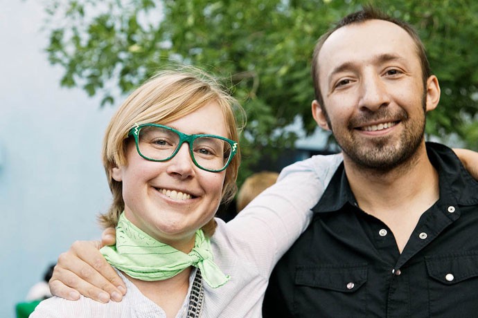
5) Put people’s heads near the top of the frame

Unless there’s a good reason not to, try and put the top of people’s head’s near the top of the frame. This is the case whether it’s a tight shot only showing one person’s head and shoulders, or a group shot showing a bunch of people full-length. A lot of cameras’ main focus point is in the middle of the frame, so the tendency is to put that focus point on a face and leave it here, resulting in lots of blank space or clutter in the top of the frame. Cameras that have face recognition can help with this, but you still have to compose in a way that fills the frame.

For extra credit, move the main subject to one side or the other — often, putting things right in the middle sounds like the obvious choice, but in fact placing them to the side creates a more appealing image.

Heads near the top of the frame, out of the full sun, nothing too distracting behind them . . . guests at a MIX Santa Fe event I photographed over the summer

6) Get out of full sun

Especially here in bright New Mexico, shooting outdoors people outdoors in the daytime can be a real challenge. There’s such a contrast between the brightest areas of an image and the dark shadows, that most cameras struggle to capture the full range — either something will be blown out (full white, with no detail), or too dark. And nobody looks good squinting in bright light, or with ‘raccoon eye’ from strong shadows on their faces. So, if you can, photograph people in shade, where they’re looking towards the light. This will mean there’s an even light on them, which is much more flattering, and that they’ll likely have catchlights — little bright spots in their eyes, which bring the images to life.

7) Mix up the range of shots

If you’re shooting an event, make sure to get a range of different types of images. So that could include individual portraits, couples, larger groups, a wide shot of the whole event (sometimes standing on a table or looking for a higher vantage point will help here), and some detail shots (if there’s some nice food on offer, get some images of the spread). Also mix up the landscape (horizontal) shots with the portraits (verticals). Depending on what you’ll be using the images for, being able to give the person laying out the blog post or designing the newsletter a good choice of images can really help.

A details shot from the MIX Santa Fe event.

8) Try not to use the flash

Most cameras built-in flashes make people look washed out and ghostly. The light hits the subject full in the face, and often the background disappears to black — it’s not a good representation of the actual scene. If it’s not too dark, switch the flash off and depending on your camera’s settings also try increasing its ISO (how sensitive the camera is to light). If your images are coming out blurry (because the camera has to use a slow shutter speed to let in enough light for a decent exposure), then you’ll have to turn the flash on, and live with what you get (see the last point on what a good camera can give you).

8) Do some processing afterwards

This is one of the main reasons professionals’ images look much better than amateurs — the pros work on the images after the fact. A bit of time spent cropping some images, or adjusting the contrast or exposure on others can really make a difference. Most pros shoot RAW images, which give greater leeway for adjustments, but even if you’re shooting JPGs, a bit of time improving the images you know you’ll be using can really help. On the Mac, the free iPhoto program can do a good job, but if you’re going to taking a lot of images a program like Apple’s Aperture or Adobe’s Lightroom will give you more powerful adjustment and organizing tools to help you manage your images.

9) You don’t need a good camera, except when you do

For a lot of daytime images, pretty much any camera will give you an acceptable image, there are a few situations where a good camera can get a shot that you just can’t with a phone camera or a point-and-shoot. If you really want a blurred background and the subject in focus, you’ll need a camera with a larger-sized sensor (at least Micro 4/3rds but APS-C or full-frame are better), and a lens with an aperture of around f/2.8 or below (depending on its focal length).

Similarly, these type of features will help you get images in low-light without a flash. For the image at the top of the page — an architects’ event I shot for the local chapter of the American Institute of Architects — I used a Canon 5D MkII and a 50mm f/1.4 prime lens (and wall to put the camera on). Such a shot would have been almost impossible with more consumer-focussed cameras.

If you’re taking shots of fast-moving subjects (sports, or kids for example), you’ll need a camera that focuses quickly and has no shutter lag — so when you press the button, the shutter opens almost instantly.

Time for the professionals

There are times when you need both a good camera and a good photographer behind it. Sometimes what seems like an ordinary location — like a hotel conference room, for example — can have shocking light and be very difficult to shoot in. Or you have just a couple of minutes to get a good image or an important person giving a speech. Or you’re looking for a particular powerful image to use prominently in campaigns. Or you don’t have the time to shoot and edit hundreds of photos from an event because you’re busy hosting the event . . . you get the idea.

Even in more benign circumstances, a professional will almost always deliver a better set of images than the ones you’ll be able to get. Here’s the full set of images I took at that MIX event I’ve mentioned as an example — they present a good picture of a hip summer event instead of looking like a set of party snaps made with a cellphone.

So sometimes you really should call a professional, but other times if you can take these points to heart, you’ll end up with good images for your site or social media needs. If you have any specific questions, feel free to comment below and I’ll try and answer them for you.

- — As well being a professional photographer available for work in New Mexico and elsewhere, I also teach workshops on taking better photos for social media and your site. Get in touch if you’d like more information or you have a project you think would be up my street.

Categories
Blog Moore Consulting

Finding your core as a creative professional — where subject, tone and medium meet

Tony Bourdain can teach us a lot about finding your core. And making the perfect beurre blanc. Photo: Sifu Renka

I once saw an interview with polymath academic George Steiner. He’s written on a range of topics and he was asked what field he thought he really belonged in. ‘Fields are for cows,’ he replied.

I too am suspicious of the idea that you have to specialise so thoroughly that you only do one thing. But how do we balance doing interesting work in a number of areas, without spreading ourselves too thin or presenting a confusing message to potential clients? Nobody wants to be seen as a jack of all trades, master of none.

The key is to find that core of your personality that remains consistent, however differently it gets expressed. Especially if we work in creative endeavours, this seems to me to be the real goal of our working life.

Exhibit A — Anthony Bourdain

Let’s start with an example of how this can be done well. Anthony Bourdain is a chef, writer (Kitchen Confidential is so good), TV presenter, publisher, and (it turns out) comic-book creator. Across a wide range of activities and a number of years, he ties it all together by offering a consistent unapologetic version of himself.

“I write, I travel, I eat and I’m hungry for more,’ says the introduction to his No Reservations TV show, and his outspoken, energized, cynical and committed tone in the show is recognizable instantly in his writing.

And when you hear he’s going into comic books, you know what to expect, even if you’re surprised that he’s doing graphic novel work.

Bourdain’s attitude is backed up by his ability, of course. He’s knowledgeable and skilled across the areas he works in, but it all chimes with his personality.

On a corporate scale, moving into new areas is known as brand extension — Calvin Klein make clothes, but also perfumes, home interiors products, sunglasses . . . they’ll tell you they’ve distilled the essence of the brand, and then carried that into whatever new endeavours they’re embarking on.

So how do we do that ourselves?

Where Subject, Tone and Medium meet

And on a personal level, you similarly need to establish what the essence of your personality and offering is — your brand. I used to think this was a process of decision-making — you could sit down with a pen and paper and choose some plausible version of yourself to present to the world.

Now I see it’s less about decision and more about discovery — whatever you decide won’t work unless your heart’s in it — your created version might contain elements of yourself in it, but unless it’s authentically you, it won’t guide you in your work. Even if it fits a gap in the market and calls for you to use your skills, if it doesn’t really chime with you, it will be a thin jacket that won’t keep you warm over time.

The other risk is that you’ll morph yourself to be whatever you think people want you to be. Photographers often fall into this trap — one day they’ll decide that boudoir shoots and one group of pre-sets is for them, the next it’ll be family photography with a different pile of Photoshop actions. It’s clear the photographer doesn’t know themselves well enough to work what they really want to shoot — no wonder potential clients are confused.

One useful way to think about this is this diagram.

Right there — where Tone, Subject and Medium meet — that’s your core. There are lots of things you could cover as your subject area — for Bourdain it’s rooted in food. And there are lots of media you could use to explore this — music, street art, photography, blogging, PhD theses. And there are lots of tones you could employ as you’re producing the work. Bourdain’s is outspoken and darkly funny, Clavin Klein’s upscale, preppy but approachable.

Once you know where you’re rooted, you can move around a bit. Some moves would take you out of the intersection of these circles — for Bourdain, a comic book still works, but a ballet might stretch the tone (and subject matter too far). Or if he kept the tone and media the same, but was suddenly doing a show on quilting, then the subject matter’s gone too far.

Storytelling as my MO

So how does this consistency work for me? I help organizations with their internet presences, do commercial and family photography and write stuff for magazines, blogs and newspapers. I used to keep these elements separate — not telling the web clients I could write, for example, or not telling either I photographed things.

But I realised that what all these elements shared a commitment to storytelling — communicating sometimes complex things in a way that is both entertaining and informative. Documenting reality with attention and skill — across different media, but with subject matter and tone that tie it together.

So with the family photography work, I don’t pose the kids or seek to prettify things. I chase them around (ideally in their own environment) while they do the stuff they’d normally do. How else should I tell their stories accurately?

And the same is true with the website strategy work for organizations. I don’t do cheesy slogans or vapid marketing sites — I help organizations tell authentic stories about what they do and how they do it. In all the work I do, I try to be wry, smart, thoughtful, enthusiastic and warm. Not because I think that’s what sells, but because that’s who I am.

And the subject matter has something in common, too — working for non-profits, creative professionals and families there’s a basis in creativity, children and compassion. Creating written content for the Folk Art Market that helps artisans improve the lives of their families through their art, a commission to photograph a pair of brothers, or a website for an architect might not seem to have much in common, but for me they make sense.

I’m deeply impressed by photographers who seek out difficult subjects and shoot them bravely — like Joe Arnon’s moving series on a drug addiction in Denver, but that’s not me.

Having a sense of what fits you in tone and subject matter makes it a lot easier to know what work you should say yes to, and what you shouldn’t.

If you want to keep paying the rent, you might have to take some jobs that are outside your core subject matter, tone or medium areas, but your best work will be done at their intersection. So go look for your centre.

Categories
Moore Consulting Photography

“Everything we do, we film or photograph” — how Greenpeace uses photography

The crew of the Greenpeace ship MY Arctic Sunrise construct a ‘heart’ with the flags of the 193 country members of the United Nations on an ice floe north of the Arctic Circle. © Daniel Beltra / Greenpeace

In a recent interview the magazine for pro photographers Photo District News spoke to John Novis, head of photography at Greenpeace International about the way his organisation uses photography to further their mission. (The article is here, sadly behind a paywall.)

For the past three years, Greenpeace has won World Press Photo competition prizes for news and nature stories they’ve commissioned — showing their commitment to quality photography, and also showing how the lines between journalism work for publications and for non-profits and NGOs are blurring.

Novis was very clear about the results Greenpeace get for their investment in quality photography (emphasis mine). “ We have always put a big budget in visuals. Everything we do, we film or photograph. We hire good freelancers, go to remote places and do good stories. . . It used to be basic direct action [coverage] on the hard news side. Now there’s much more documentation and stories in response to environmental news events.”

He’s also very keen on adding a multimedia element to the work the photographers are doing as the expectations change: “Everything is more Web based, so we’ve been doing a lot of work that combines photography, video and audio.”

One element of this is the Greenpeace Photos iPad app — a regularly-updated portfolio application that showcases the best of Greenpeace photography.

Like all NGOs and non-profits Greenpeace is trying to have the most impact for the least amount of money. If they’re investing so heavily in quality photography, it’s obviously because it works.

That old online forum cliché that ‘this thread is useless without pics” has never been more true across the internet, especially for social media channels. Look for strong stories in the work you’re doing, and then tell them visually. Are there events, programs and projects that your organisation is engaged in that aren’t getting the photography they need?

Categories
Moore Consulting

Why the websites I’ve built have failed

I’ve built a lot of websites over the last 8 years of running a web design firm and working for other firms before that. The first professional website project I worked on was in 1995 — so let’s call it 75 sites since then, but it might be nearer a hundred. Most have been small and medium sites for small creative business and non-profits.

And when I look back at them and check out the ones that are still up, it’s clear that most of them have failed. They look fine (or better), the client’s have been satisfied (or happy), and there’s been no catastrophic disasters leading to law suits or even anything but a tiny amount of downtime.

But even though a lot more than half the work I do on the website side of things now is repeat business with long-standing clients it’s clear to me (if not always to the satisfied clients) that nearly all of the sites I’ve built could have done a lot more, and delivered more to justify the money and effort that went into them.

Not a technology challenge

Years ago, I was an early employee at the Dublin-based internet consultants iQ Content. Morgan McKeagney the boss would tell clients that building a successful website is not a technology problem as much as it’s a people and process problem. He was right then, and he’s even more right now. Setup a Squarespace account, or go for a one-click WordPress install with an off the shelf template and you’ve just launched a site that’s more robust, easy to use and attractive than 90% of websites out there.

It’s what’s happened before and what happens after that launch that will define whether or not your site actually ends up working for you. Solid technology won’t count for much when there’s not been an update for five months, or prospective clients can’t find what they’re looking for because management decided they would only put up sales fluff not detailed specifications.

So here are the biggest reasons the sites I’ve worked on have failed:

1) No clear audience or objectives

‘I want my site to appeal to everyone,’ says the client. If I’d had a dollar for every time I’ve heard that, I could buy a case for the iPhone 5 I can’t afford. Not knowing who your site is for is going to make it very hard to choose the content and features that will engage that audience.

And if you don’t knowing what the organisation’s detailed objectives are, it will be hard to plot a route to get you there. Most business want their site ultimately to generate more sales, for example, but exactly how will it do that? And non-profits want to raise awareness and increase engagement and donations and other similarly nice ideas, but unless you can stand over every piece of content on the site and explain why it’s there, who it’s for and what you want to get out of it, then you don’t have a good enough plan.

2) No buy-in or engagement from management

If the company at large doesn’t care about communicating online (through the website and other channels), then even if there’s a budget and it’s someone’s job to get a site up, the long-term prognosis is not good. Especially as the current demands for transparency and sharing mean that organisations with a defensive and closed culture need to change — if everything that goes out has to be approved by senior management, a website will struggle.

The lack of commitment sounds like a problem that would only beset larger organisations, but I’ve seen it even in a one-person business. The owner told me he knew he needed a website, and was OK paying for one, but he had no intention of keeping it updated or carrying out any of the other suggestions I came up with to help him. Any guesses as to how well the site’s done for him?

3) Groupthink — the site is all planned out before the client’s talked to people who know about websites

This is why I don’t respond to RFPs for site work (I did it once, against my better judgement, got the job and then had a miserable time for nearly a year). The problem of RFPs is that it makes organisations think they know what should be on the website and what it should look like before they’ve spoken to any experts. They’ve drawn up the specification (they’re the architects, so to speak) and it’s the job of the web developers just to build it (to act as the contractor).

Clients might think they know what they want — especially since they’ve looked at the prettiest sites they can find from similar organisations — but unless they’re asking themselves hard questions and have a lot of web development experience in-house, the chances are they’ll miss some crucial things or are just heading in the wrong direction entirely. And when I arrive and tell them they should really start the strategy and planning again, they’re both already wedded to the ideas they came up with themselves, and don’t see why they need to spend money on a process they think they’ve successfully completed themselves.

Everybody seems to build their site based on what other people’s look like. Benchmarking is OK, but the problems with comparing your imagined site with other people’s finished sites are manifold:

  • you don’t know their budget, constraints or resources (chances are if it’s a brilliant site, you can’t afford it)
  • you don’t know exactly what they were trying to do with the site (their objectives are likely different from yours)
  • you don’t know if they think it’s succeeded (you might like it, but they might hate it)

People tell me they want videos and still photography of the same quality as charity:water’s, but they don’t want to hear that charity:water have a whole in-house multimedia production team plus a pool of talented contractors they’ll send all over the world, and they don’t.

It’s much better to get someone in when you’re first thinking about a new site, so you can be realistic about your expectations, and precise in your objectives — it will save lots of time and result in a better end result.

4) Poor quality content

This is the biggest long-term reason for the long-term failure of most of the sites I’ve worked on. Most clients have no problem paying for graphic design and technical work on their site. They recognise the infrastructure and look and feel as crucial elements in their project, and see why professionals should be involved in this work. But very many clients completely fail to see the importance of paying professionals to work on the site’s actual content — even though the content is the reason people are coming to the site in the first place.

Part of this is a misunderstanding of their own abilities. Clients know their own work for sure, but that doesn’t make them qualified to write about it, or take photographs for the website. Writing internal documentation is completely different from producing work that connects with an audience, drives them towards particular actions and eloquently communicates key ideas about a project or plan. Similarly, having a good camera doesn’t make you qualified to take high-quality photographs or video that can move and persuade people, any more than having an excellent set of pans makes you a Michelin-starred chef.

These content creations skills may seem ‘softer’ than the more technical skills needed on a web project, but they are more difficult for people to master, and honestly more important to the overall success of the website. I wholeheartedly believe you should spend as much on the content for your site as on the infrastructure and design. And almost every time I say that, the clients nod and then ignore me even though it means they’ll have a solid and attractive site containing bad content that doesn’t do what it needs to do.

5) No regular content updating

Of course, good content when the site launches is only the start. The ongoing success of the site depends on high quality regular content and you want your site to work for you across several years not just for the first two weeks after launch. Your site will do nothing for you if you don’t keep it regularly updated: Google will abandon you, visitors will come once and never return, and you’ll lock yourself out of your car in the rain (OK, one of those isn’t true).

Potential donors, clients or partners want to know about you and what you’re doing. They want an insight into what you think, how you approach things, what you’re working on. They want to see that other people like them have decided to work with you, and they want to see that you know what you’re talking about. All of these things are accomplished online with a regular supply of good content. All they see from a stale site is that you once put up a half-decent website, but now don’t care enough about what you do to keep it current.

Yes, it’s a huge pain to do, and nobody has the time even if they have the skills. I’m a professional photographer and former journalist for a national newspaper and even for me keeping my sites up to date is about the hardest thing I have to do each week. It’s so easy not to let it slide — ‘real’ work comes up, and you think it won’t make much difference if you miss a scheduled blog post (always assuming you have a schedule), but each time you don’t update your site is another opportunity missed to reach someone or deepen a relationship.

Increasingly, organisations are expected to produce what’s essentially a long-term mixed-media documentary project about themselves, in addition to whatever it is they’re actually supposed to be doing. No wonder they should call in professional help. As well as a budget and plan to get the site built and launched, you need a budget and plan for running it. Sounds obvious, but it’s very hard to make clients do this.

6) No social media plan

If the documentary project we should all be embarking on is based around the website, it needs satellite offices in other social media areas. Your audience (or the people you’d like to have as your audience) spend way more time on Twitter, Facebook, Pinterest or wherever than they will on your site, so you need to meet them there. Not so you can constantly sell at them with promotions or deals, but so you can share a little about yourselves, and more about the broader community you’re in — passing on useful resources, helping people out.

And when you’re creating content for the site, you should have an eye on what life it will lead across the social media platforms — is it something that people will pass around to their friends, and if they do, how will you help that, measure it and build on that publicity?

These days a website without a social media plan and the resources to implement it is a little like building a great new store in the middle of a wilderness. It might be amazing, but everyone’s doing stuff somewhere else.

Build it and it will be built

Many of these reasons for failure sound obvious, and they are. But it’s also obvious that we should all exercise more, eat better food and call our parents more often. Just building a site of some sort just means you’ve built a site — it won’t make it successful.

André Gide pointed out that ‘Everything that needs to be said has already been said. But since no one was listening, everything must be said again.’ I’m outlining the failings in the sites I’ve worked on myself partly to help other people, but just as much as a reminder to myself to try and make people listen.

If you’ve got suggestions for any other failings you repeatedly see, please let me know in the comments.

Categories
Moore Consulting Photography

Dogs in the office — public relations dogs

Welcome to the Office

A lovely open office with a great view in the hills above Santa Fe — not a bad place to bring your three dogs to work. Especially when your commute is a walk across the yard from your house, as is the case with Clare Hertel, principal at public relations firm Clare Hertel Communications.

When I show up, Clare’s black lab Hatch is so excited to see me he jumps in the back of my car, and even when we walk up the stairs to the office he’s very interested in me and all my gear.

Eventually though, he resumes his normal position in the office — sprawled on the floor with old golden Huck. Young buck Mellie takes the first watch sitting outside the door.

Complete with bright works of folk art from one of Clare’s clients, the Santa Fe International Folk Art Market, the office has a great feel. Clare is at one end, Clare’s assistant Joy at the other, and the dogs in the between. Old mellow cat Daisy tucks herself into the back of Clare’s chair and successfully ignores all the dog shenanigans.

I’m beginning to notice the different types of interactions between the dogs in the different offices I’ve been in. In Trey’s office, the dogs got each other excited and all chased around like crazy. In Kimberly’s, Archie was the main dog who moved around from chosen spot to chosen spot while his friend cowered under the desk the whole time I was there.

Clare’s dogs — who have the option of staying in the main house with Clare’s husband, but prefer to come work — were pretty mellow but communal. They lay down beside each other, or looked up when one of them moved around, but they didn’t scamper and bark too much once they got over their initial excitement.

Thanks to Clare and Joy for letting me crash their working morning.

Do you know a dog-friendly workplace in the Santa Fe area that would like a visit from a photographer? Let me know in the comments or via email — david@moore-consulting.net

I’ll take the first watch

Did I miss anything?

Yin and Yang

Hard at work

Old dog smile

Categories
Moore Consulting

Make it Personal — Six Ways Non-Profits Can Connect with their Audience

One of the many strengths of the Santa Fe International Folk Art Market is that people get to meet the artists they’re helping with their donations and purchases of authentic folk art (such as Mireille Delismé from Haiti, shown above). You can’t get much more personal than that, but there are ways to communicate this immediacy online and in print, too. Photo: David Moore.

Why one person’s story is better than all the pie charts in the world

I’ve worked with a range of non-profits on projects, and it would seem they have the perfect material for the content-rich, engaging type of web presence that really works.

But all too often, they can’t see the wood for the trees. How they explain what they do and its impact often sounds more like a briefing to market analysts than anything that will grab an audience and make them want to get involved.

Too often, it’s ‘We fund this many projects in this many countries, and every year we raise this much money to do it. Our average grant is this much, and this percentage of our donations goes directly to projects on the ground.’

This might be how to outline a rational case for why I should donate (along with PowerPoint slides containing some pie charts), and I certainly want your organization to be run on a rational basis, but reason alone isn’t going to make me want to help.

So how should non-profits articulate their purpose and results powerfully? You need emotion — harder to control, not quite so businesslike, but so much more effective. We support those causes we connect with emotionally.

In their great book Switch: How to Change Things When Change Is Hard, Chip and Dan Heath explain that people think the decision-making process goes: Analyze, Think, Change. In other words, if I present a well-reasoned case, people will analyze the situation logically, and decide to change their behaviour accordingly.

In fact, the process is often more like: See, Feel, Change. I show people a compelling example of what’s going on, it makes them feel an emotional response which dictates to them how their behaviour should change.

Make it Personal

So as a non-profit you need to craft your messages in a way that will make people feel. And that’s not with pie-charts, it’s with stories. An emotional connection is made most strongly with a story — something that makes the cause personal, and invites people to imagine themselves in a particular situation.

Here’s an example. In the Japan earthquake and tsunami last year, nearly 19,000 people were killed or are unaccounted for. That’s a large and tragic number, but reading that number probably didn’t make you feel very much, because it’s hard to make an emotional connection with a large number.

But when we’re invited to connect to one person, we find it much easier to empathise. Here’s a photograph of one of the survivors.

AP Photo/Asahi Shimbun, Toshiyuki Tsunenar

I bet that got a much stronger reaction from you than the amorphously large number. You can imagine being in that woman’s position, you notice the horrendous scale of the destruction, and you might pick up on some of the moving details — like her bare feet. By any rational analysis, the thought of 19,000 people dead should drive you to action, but since we’re not that rational, I’d warrant this photograph moved you much more strongly.

Talk like a journalist not a non-profit employee

For a non-profit, some proportion of the site’s audience are looking for a just-the-facts approach — for example, employees at foundations considering a funding application have specific requirements. But depending on what sort of nonprofit you are, the engagement of individual donors and volunteers is much more important, and best done with stories, testimonials and case-studies. But this means using a vocabulary and approach that most often the staff at the non-profit themselves don’t use.

What they need aren’t the skills and approach of the average non-profit employee, but those of a journalist, documentary photographer or film-maker.

There’s a reason journalists tackling a big story will look for individuals to represent the overall situation — it works. So, for example, if the story is on Ireland’s worsening economic decline (and related emigration), you don’t just research the data, you go and find a real street in a real town and ask the business owners what their experience has been; then you go the airport and talk to young people as they’re heading off to look for work in London and Sydney.

Don’t worry that you’re not explaining everything about the issue. So long as you’re true to the individual stories you’re telling, you’ll make much more of an impact that giving the 30,000 feet overview.

Six Ways to Connect Better

1) Think of how a journalist would tell the story of what you do

I increasingly see my role with many clients as being an in-house journalist — using professional communications skills to produce material that informs and engages an audience. And this is the approach that you should take when you’re creating your own content. Journalists know that people don’t have to read their work or look at their photos or video — it has to be worth their while.

2) Be specific: look for one or two projects or successes

You’ll need supporting facts and material, but it’s more important to find a hook to hang this on — an area of your work that exemplifies what you’re all about. Choosing this can be hard, especially if there are a number of people in the organisation keen to put forward their areas as the most important. But you can’t and shouldn’t try and give a completely comprehensive overview — the same way newspapers don’t give every story equal weight. Some stories just have more impact — your job is to find them.

3) Be Personal

Within those projects, find real people affected by your work and choose just one or two. If there have been hundreds of people involved, it will tempting to want to show the scale of the operation, but you should resist that urge, at least at first. Once you’ve got people responding with emotion to a particular facet of the story, you can then broaden the scope and show that what’s happening to this one person you now care about, is also happening to many others. But you have to make that emotional connection first, and that starts small.

4) Use your subjects’ own words

Where possible, you should let the people whose stories you’re telling speak for themselves — don’t just hold them up as examples. This is done with details — take strong photographs or record good video, and include direct quotes in any written work.

5) Choose the best media for the story (and use them well)

It’s great that it’s now affordable to create stories in any number of different media types — including video, audio, stills photography, a well-written blog post, or an interview via Skype. Videos and images get more responses and shares on social media, increasing your impact, You don’t have to spend a lot, but unless you have professional-grade skills yourself, you need to spend something. Your audience will notice (and be distracted) by poor-quality media, writing or images.

6) Give the audience different ways to get involved

Not everyone will reach for their credit card after they’ve experienced the story you’re telling, but they might well want to keep in touch with the organization that has just made them feel something. So multiple options for keeping connected (with different levels of commitment for different comfort levels) is a great idea — from making it easy to share the story themselves, to email newsletter signups through to instant donations and memberships.

Putting it All Together — charity: water example

While I was writing this post, a note from charity: water appeared on my Facebook wall. It was a video for their current September campaign, and it is a good example of many of the points I raise here (even if I could do without the creative director’s pieces to camera).

It tells the story of one Rwandan family’s day — including the three hours the kids spend fetching dirty water from the river.

It’s not perfect, but the video gives you a connection to real people that you can help. Being asked ‘Would you like to help bring clean water to a Rwandan village?’ doesn’t involve our feelings in the same way as ‘Look at this particular family and what they have to do every day. Would you like to help them?’.

Make it personal, and you’ll make a difference. And don’t rely on the pie chart.

Categories
Moore Consulting

Communicating Compassion with a new site for Veterinary Cancer Care

I’m very happy to announce the launch of the website I worked on for Veterinary Cancer Care (VCC) — a veterinary oncology practice based in Santa Fe and Albuquerque.

The site is a great example of the sort of holistic approach I like to take to a client project — I worked on the web development, photography and multimedia work to bring it all together as a consistent whole.

Dr Jeannette Kelly of VCC is a devoted and caring vet, and her practice has helped thousands of pets with cancer. Her website was out of date and didn’t really communicate the key message of the practice — that treating pets with cancer is completely different from treating humans with cancer.

The feel of the practice is warm and caring, and although it’s obviously a difficult time for clients, they were positive and grateful for the compassion and skill Dr Kellly and her staff showed to the pets under their care.

Since most visitors to the site would be coming after receiving bad news from their primary care vet, it was important to dispel their misconceptions and make them more comfortable considering VCC.

It seemed to me that explaining the treatment options and the qualifications of the staff, while necessary, wouldn’t be enough to counter the potential client’s idea that veterinary oncology was going to mean suffering for their pet in a cold and unwelcoming environment. We were dealing with powerful emotions here, so an appeal only to reason — however much it made sense — wouldn’t be enough. An approach that also worked to calm fears and make an emotional connection was also important.

Having spent time at the practice, I knew that the atmosphere there was warm and positive, and the animals loved and cared for. Dr Kelly herself encapsulated this feeling that was so different from what you might expect when you think about cancer treatment — she’s bright, energetic and funny. When talking to owners, she’s often to be found on the floor at pet level, bonding with the animals.

I decided to use documentary photography to capture the authentic experience of the practice, and then record an interview with Dr Kelly about how approach and how she got started with veterinary oncology. You’d want a vet who was emotionally committed to this difficult side of medicine, and Dr Kelly’s story shows she has this in spades.

The audio from the interview would be packaged with some of the still images and background noise of life at the practice, and we would use that on the About page.

Introduction to Veterinary Cancer Care, Santa Fe, New Mexico from David Moore on Vimeo.

Meanwhile, the Amy, Megan and Jan from VCC started gathering useful information and resources so the site would make a compelling emotional case but then back it up with practical information for new clients who need to learn a lot in a hurry.

VCC already had a good graphic identity and color palette that they used for print materials, so that was foundation of the web design. We also wanted the design to be calming, warm and welcoming — the feelings you get walking into the practice. So the use of serif fonts and subtle shading and textures creates a site that is clean and simple to use without being austere.

Looking to photograph authentic moments of what happens in the practice takes a lot longer than just staging some shots with clients, vets (and animals) all smiling at the camera. You have to be there, in the right place to make strong images out of what really happens. A little exchange between staff member and owner, or a pet suddenly licking Dr Kelly’s face are situations that you can’t set up, and if you miss the shot, it’s not coming again. But I feel that people can tell what’s real and what’s fake, and real images have so much more force.

There are more photos from the project here.

The combination of a clear approach, good design, photography, multimedia and useful resources presents an authentic and positive view of Veterinary Cancer Care. And personally, it was one of the more rewarding projects I’ve worked on recently, as I got to see the great work that goes on there, and help them communicate what they do.

And the folks at VCC are also happy. Dr Kelly says,

‘We are delighted with our new site because it captures the essence of our practice and the hope we get from our patients every day.

‘David immersed himself in Veterinary Cancer Care for several days in order to capture the sights, sounds and perceptions of the clinic, and the website mirrors the feeling of our space and our philosophy perfectly.

The website design and photographs emulate the light, bright, welcoming feeling our patients and their people get when they come to see us, and our focus on hope and care is clearly the foundation for the design.’

You can find them at http://www.vetcancercare.com

Categories
Moore Consulting Santa Fe and New Mexico

Redesigned site for the Santa Fe International Folk Art Market

I’ve been working with the Santa Fe International Folk Art Market for five years now — designing, building and maintaining their website, writing blog posts and photographing artists and their great work.

Their site for the last three markets had worked well, but it was built on an older content management system and needed some freshening of the design and more functionality before this year’s Market in mid-July.

Stronger images, easier to update

I worked with the Market on a new design, aiming for a cleaner look and a wider main column for displaying larger photographs. The Market has a deep library of excellent images that show the real people around the world that are helped by the Market (I’ve taken some of these images — that’s one of mine used on the bottom-left of the homepage — but there’s a talented pool of other photographers who also contribute images). Being able to display photographs in a wide main column gives them more impact, and also gives more flexibility in wrapping text around images, especially for blog posts.

Another aim was that the site be easier to update. While I’ve written nearly all the blog posts in some years, this time round most were written by Clare Hertel Communications — the PR firm that’s also worked with the Market for many years. Making the blog section of the site full-featured but also easy to use was very important.

Going custom

Once the new design was approved, I planned the move to WordPress from the older CMS — a job that was more involved than for a more straightforward site.

The Market sites includes a blog, a news section and a section containing hundreds of artists’ profiles categorized by the countries they’re from, and the years they’ve attended the Market. WordPress by default only supports two types of content — regular site pages and blog posts, so I devised an architecture based around using custom post types and custom taxonomies to cater for all the different types of content and classifications required.

This means that adding an artist lets you specify a country and years attended when you’re adding the content, and then displays the content in the right place on the site. I also implemented WordPress’ ‘featured image’ functionality to automatically generate thumbnails and associate them with blog posts, news releases and artists. So adding a new blog post for example, automatically places its title and thumbnail on the site’s homepage without any direct editing of the homepage.

Then we moved all the existing content to the new site, and then tested the new version prior to launch.

The WordPress framework for the site now makes it easier for the Market to updated the content themselves, and also allows us to use some of the wide range of plug-ins available to add extra functionality. This is seen in the front page slider which displays revolving selection of banners. It’s also search-engine friendly and easy to add updates and patches as the WordPress core is constantly updated.

The blog area now supports captions for images, embedding maps into posts, and auto-generated slideshows.

Good-looking and built to last

The result is a site that has a contemporary look, a solid custom-designed infrastructure and a framework that supports the range of content uses the Market needs.

The work was completed in time for the busy build-up to the Market, and the site made it much easier than in previous years to add this year’s new artists, blog posts, news releases and other content. It also held up well to the large amount of traffic it receives around the Market weekend — peaking this year at over 4000 visits and 15,000 page views a day.

As the Folk Art Market moves into its tenth year in 2013, their site is a key asset in good shape, and it’s ready to support new endeavours and requirements in the future. I’m proud to have been involved with such a great Santa Fe non-profit organization for the last few years, and look forward to continuing my work with them.

Categories
Moore Consulting Photography Santa Fe and New Mexico

In the MIX — photographing a great evening event

The nice people at MIX Santa Fe — the networking and micro-finance group I like to think of as the hip offshoot of the local Chamber of Commerce — asked me to shoot their most recent event, and I was very happy to help out.

It was a party and awards presentation held at the Santa Fe Art Institute, in one the lovely courtyards of Riccardo Legoretta’s landmark building. Often evening events are held in dark hotel meeting rooms where you’re fighting with low light and loud carpets, but this was a joy.

With a bar staffed by the Cowgirl, serving drinks featuring Santa Fe Spirits’ fine local liquors, the party brought out an eclectic creative crowd. Santa Fe seems small, and you’re often running into the same people again and again, but this group refreshingly seemed to transcend a lot of the normal cliques.

Music was from DJ ‘jaro, and eats from La Cocina Doña Clara. Folks were friendly and the space gave me some chances to get some shots you wouldn’t normally associate with event shooting.

Thanks to MIX for the opportunity, and if you’ve got an event you need professional coverage of, don’t hesitate to get in touch.

Categories
Moore Consulting Photography Santa Fe and New Mexico

Dogs in the Office — design dogs

My dogs in the office personal project has started nicely. I’ve done three shoots now (more photos to follow), and it’s great to have some reason to shoot for myself that’s not just walking around seeing what I get. I’m a documentary photographer, so it’s the stories and moments that I respond to best, and with the dogs in the office, there are plenty of those.

Here are images from the session I shot with Radius Books and Trey Jordan Architecture. They share a lovely space in the same building as my office, and I’ve known Trey and David Chickey from Radius for a long while (full disclosure: I built Trey’s website).

Trey and David bring Jasper and Lola, while Jenni brings Terry, and Thomas brings Eames (what else would an architect name their dog). There’s art on the walls, lots of great space and a very hip kitchen stocked with dog treats (and some nice things for the humans, too).

For the gearheads among you, these were all shot with the Fuji X-Pro1, using 18mm f/2, and 35mm f/1.4 lenses.

Eames being shy.

Taking part in an impromptu meeting

Jasper appreciates the art.

Terry helps out

Time for a bit of affection