 I’m delighted to announce the launch of our latest website — it’s for Jeff Henig, an American travel photographer based in Japan, who specializes in shooting cultural and religious festivals across Asia. You can check it out at www.jeffhenig.com.
The challenge
When Jeff first contacted me, he had a blog in one location, a Flash-based portfolio online somewhere else, and a Photoshelter site for his stock archive. He was doing a good job keeping them all up to date, but each had a different look and feel, and navigating between them was confusing for visitors.
He was looking to integrate all three parts of his web presence under one design and navigation system to present a more polished and professional image, and make things easier for potential stock buyers or photo editors. As he says,
“I wanted to create seamless navigation and a consistent look between my Photoshelter site, my Blog and also explore ideas on a better Portfolio page. I was looking for a web designer who could fix what was wrong with my current site. The navigation wasn’t right and it wasn’t interactive enough for me. When I saw David’s personal web site a light bulb went off. I knew he could help. “
His design brief was wisely to go big with his bold images, and also to include a more involving way of showing his Portfolio than just thumbnails.
He also wanted to be able to update his blog, portfolio and archive as easily as possible.
Another potential issue was that he was in Tokyo, and I was in Santa Fe, New Mexico, so we needed a good plan if we were going to work together.
The solution
The plan we came up with used several elements:
- WordPress for the site homepage, blog and About sections
- Photoshelter for the searchable archive
- Evrium’s Fluid Galleries for the Portfolio section
Each had to be brought together under a single design and consistent navigation, to present the best experience for the user.
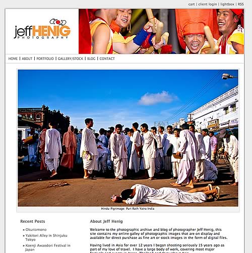
We loosely based the design on a Photoshelter theme, but customized it drastically, creating a custom banner (that shows a different image each time a new page loads), changing the background colors and adding a shadow box around the main content area.
We also adjusted the typography size and colors to match his logo.
The WordPress side of the site offers 3 main page templates — a homepage that shows a large main image, some introductory text and the titles of the latest blog entries (updated automatically). The About section features a 2-column design, making it easy for Jeff to add more pages to this section if he needs to, as the sublevel navigation adjusts on the fly.
Jeff wanted the blog’s content area to be as wide as possible, as he would be posting lots of photographs. We designed it so he could include photos up to 870 pixels wide, placing a utility area at the bottom of the page to give access to monthly and category archives.
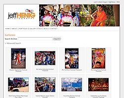
With a few tweaks to the CSS, the Photoshelter galleries fitted in seamlessly for the Gallery/Stock section. You can browse the collections and galleries, as well as search for particular topics while the layout and navigation is exactly the same as the rest of the site. Unless you were paying attention to the address bar, you’d never know you were actually on the Photoshelter site.
Incorporating Fluid Galleries
 Choosing Fluid Galleries for the Portfolio section gave Jeff the flash he was looking for in this section (pun intended), while also making it easy for him to update the galleries.
The system instals on your own server and gives you an admin panel to create and update galleries (and choose some navigation and design options). The galleries themselves are then output to Flash, creating a smooth scrolling look.
The problem is that out of the box, there was no easy to link the portfolio section with the rest of the site. We could pop it up in a new window, but we didn’t like that idea, so I took a look at the code Fluid Galleries produces, and worked out how we could embed a logo and navigation bar above the Flash area to integrate it better into the rest of the site.
Now when you’re done with the Portfolio you can easily get to any other section without having to close windows or go via the homepage. I’ve seen a lot of Fluid Galleries portfolios, but not one that works so cleanly with the rest of the photographer’s site.
Long Distance Relationship?
 Oh, and the working with someone in Tokyo bit? No problem. A few Skype calls pinned down the requirements and the plan (although talking to someone in the evening for me while it was lunchtime tomorrow for him took some getting used to).
For sending files and comments and questions back and forth we used the superb Basecamp system. I use it with my local clients too, as it keeps everything project-related in one place, but it’s even more valuable when someone’s across the world.
Result
Jeff’s new site brings all the elements together, makes it easy for him to blog, adjust his portfolio or update his Photoshelter archive. And it’s a custom design that creates the impression he wants across all his web content.
Jeff’s summary of things:
“I was very pleased with the redesign of my web site. The end result was a fresh, clean and professional looking web site. David was very professional and a pleasure to work with. I’d highly recommend him and would use him again for further design tweaks.”
Visit the site: www.jeffhenig.com


 I’m delighted to announce the launch of our latest website — it’s for Jeff Henig, an American travel photographer based in Japan, who specializes in shooting cultural and religious festivals across Asia. You can check it out at
 Choosing Fluid Galleries for the
  Oh, and the working with someone in Tokyo bit? No problem. A few Skype calls pinned down the requirements and the plan (although talking to someone in the evening for me while it was lunchtime tomorrow for him took some getting used to).